Boost reservation with multiple room selections and add-on flow.
Company
Bobobox
Time
Nov 23
Role
Design & Research
Design Category
Flow Revamp
OVERVIEW
Bobobox is a company known for its unique physical products of Bobopod (capsule hotel) and Bobocabin (cabin) in the hospitality field.
Bobobox app handles booking for those two physical products: directly allowing access to cheaper prices for multiple room purchases.
It gets even better: The new app also allows user to order good food and cool activities for their leisure—all without worrying much about availability during their trip!
OBJECTIVES
Create a personalization order for users
Provide more clarity about branch and room details for each product
HIGHLIGHTED PROBLEMS
PAIN POINTS 4
No rate plan available; the system can't support selling rooms with and without breakfast
BEFORE THE CHANGE
The legacy flow that had no major changes at all since the first time the app was launched, back in 2018.
APPROACH
For the booking flow revamp, I created two choices that could answer the problems that users need—with differentiation on the flow handling.
Then, with the help of a UX Researcher, usability testing was conducted to observe deeply which pattern between the two is most suitable for our end user demographic.
Details of the flow can be seen below.
Direct Basket

Flow A
Potential answer for pain points #1
Floating Basket

Flow B
Potential answer for pain points #1
Add Ons—at Last
Flow A
Potential answer for pain points #2
Add Ons—up Front

Flow B
Potential answer for pain points #2

Flow A
Potential best pattern from user's ends
Check-Out Stepper

Flow B
Potential best pattern from user's ends
RESULT FINDINGS & TENDENCITY
Another important highlight we found when offering rate plans in different room types is: the list of cards showing the room details must be simple enough.
Before finalize on something to get in depth of the room detail, user's very first pattern is to compare the facility and prices of each room type.
When the card is too elaborate or too long, it can be infuriating due to the need for many scrolls, back-and-forth comparisons, and numerous screenshots to manually juxtapose which room best suits their needs.
FINAL DESIGN & WHAT WE FIXED
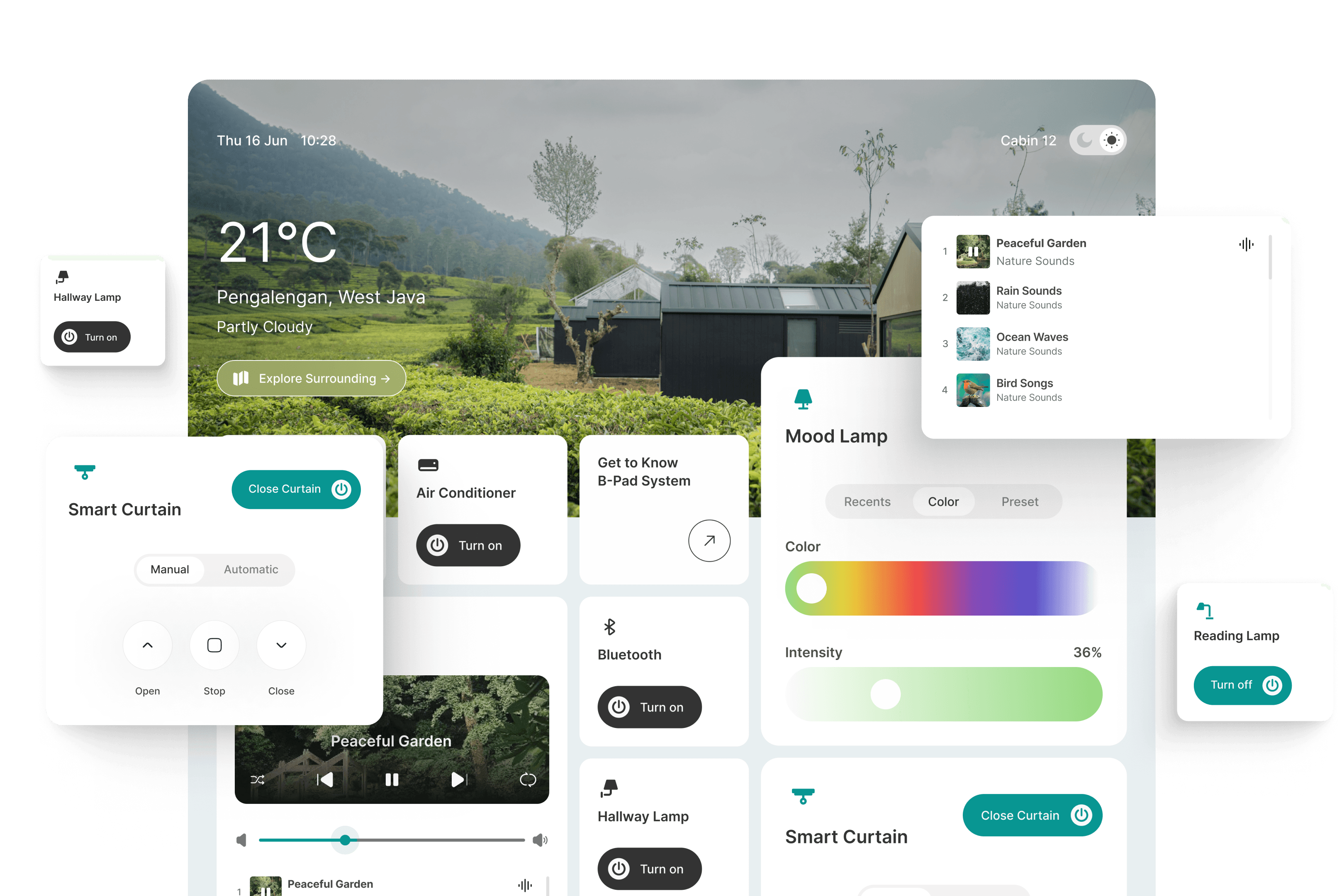
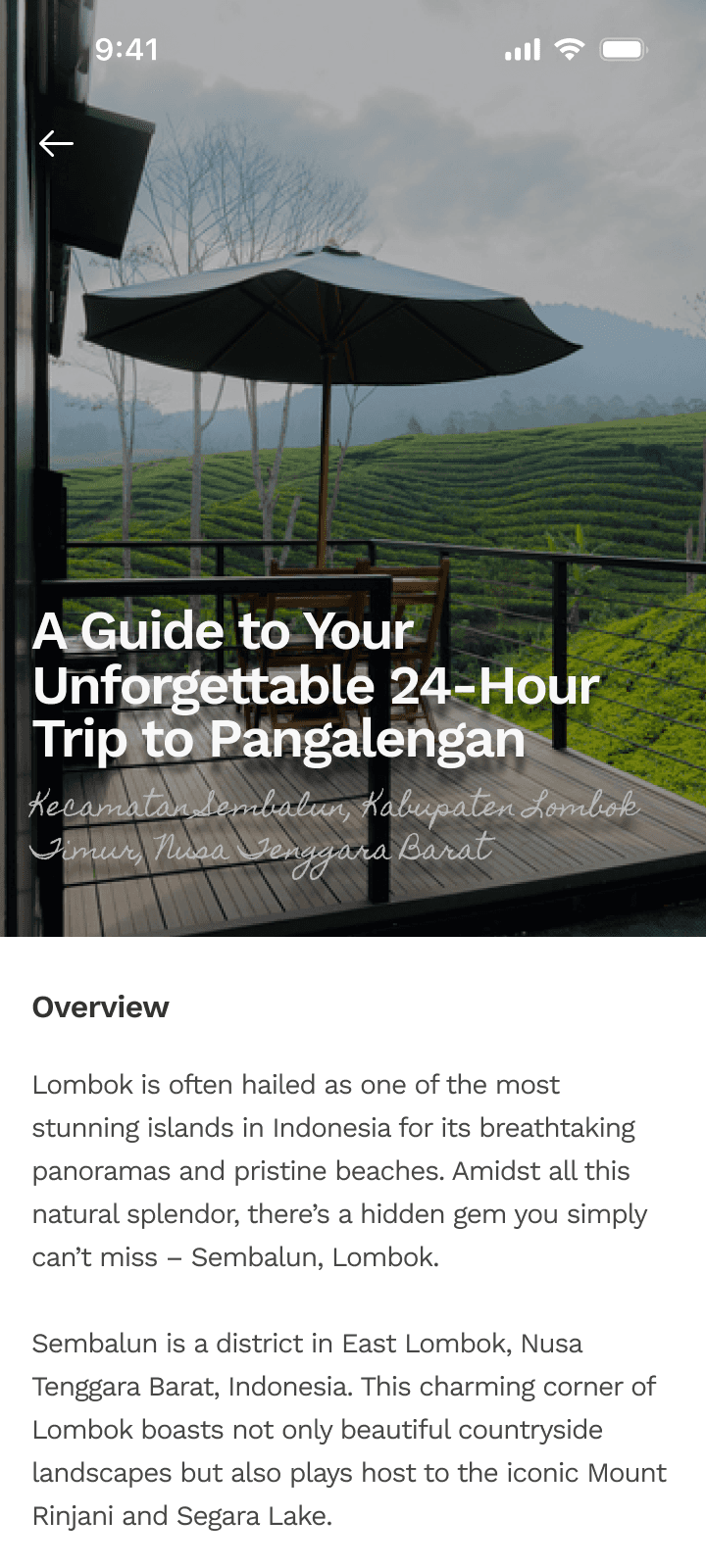
A breath of fresh air on the main page of the flow—the branch detail page—that accentuates the beauty of the physical product.

BRANCH AND ROOM DETAIL PAGE
The first few seconds where the eyes land is the most crucial part. I tried to summarize the most important pieces of information for users to grasp and present them in a nutshell about this branch by just glancing at the hero.

Findings from talking to customers during usability testing show that users are drawn into three information highlights:
1
Imagery of the Accommodation
Spotlight the beauty of the architectural build and encompass how beautiful the combination of the design and nature is.
2
Surrounding Nearby Places
Visual cues to promote more that the location is a worth visit since it's also strategic and close to other famous attractions.
3
Accommodation Choices
The one thing that users directly aim to look at after arriving at the branch detail page is the room's types and prices. Locating it not far from the hero helps the user to achieve their goal faster.
Glimpse of room while eyeing rate plan.
Thorough breakdown of what the room's got.
Better context for pictures inside the gallery.
MULTIPLE ROOM RESERVATIONS AND RATE PLAN CHOICES
Rate plans are helpful from customers' end since they do not need to worry about breakfast by only adding a rather small sum amount of money.
Especially when considering they are amidst nature in the middle of nowhere, and they ought to drive to get food nearby.
From business perspective, it allows creating more possibility for receiving revenue margins from third parties to end customers—and the pairs could be mixed and matched for a lot of things beyond FnB.

Pain reliever towards #1 & #4 problems. The new process is tailored to address the user's burden which derives from a rigid booking flow. The modified flow allows users to:
1
Easily Share & Change Availability
Share using deep-link and brought others directly to the designated date and location. Switch to more suitable dates smoothly.
2
Quickly Grip Room Type Summary
See room's facilities and detail more straightforward and to the point. Good news: it is also sticky—hence helped a lot when scrolling to see rate plan options.
3
Select to Add Room & Quantity
Select to define the number of rooms you want and combine it by adding multiple types of rooms to your cart. No more separate purchases and no more hassle of going back and forth to choose rooms with different types in the same branch and dates.
Book several room types in one go;
effortlessly add or remove on your will.


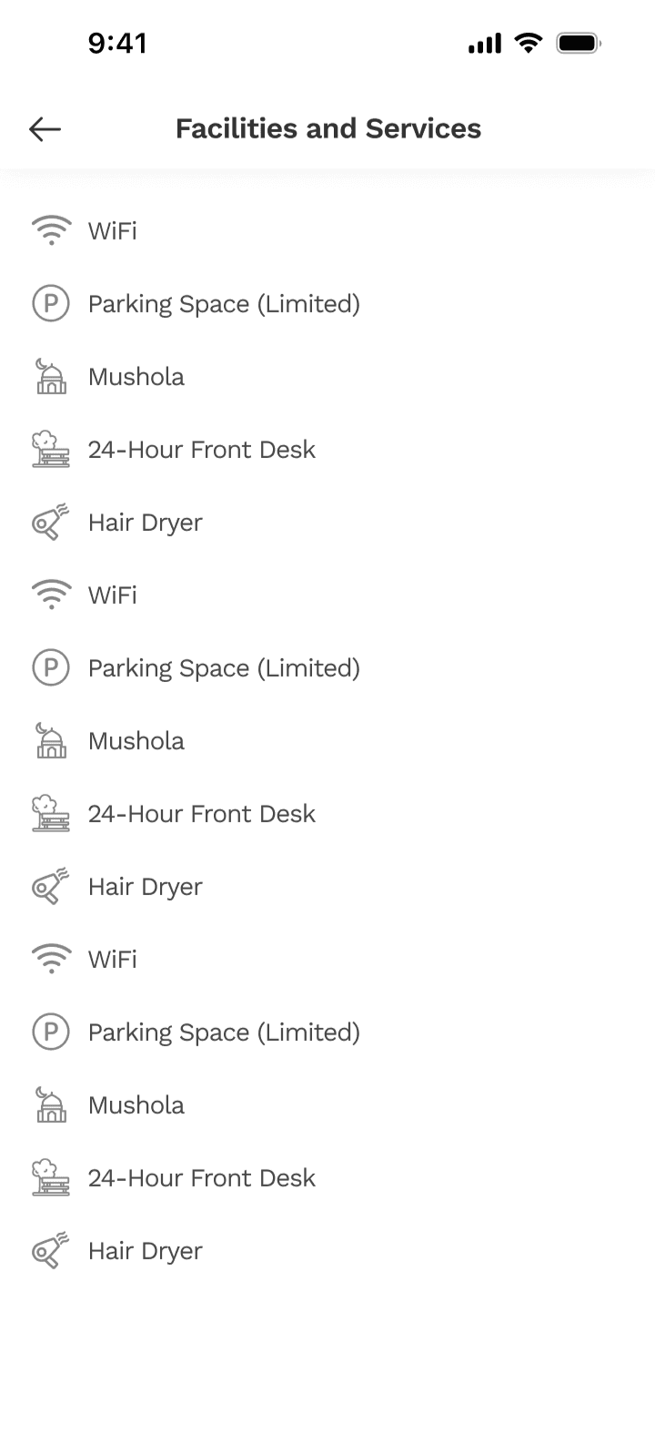
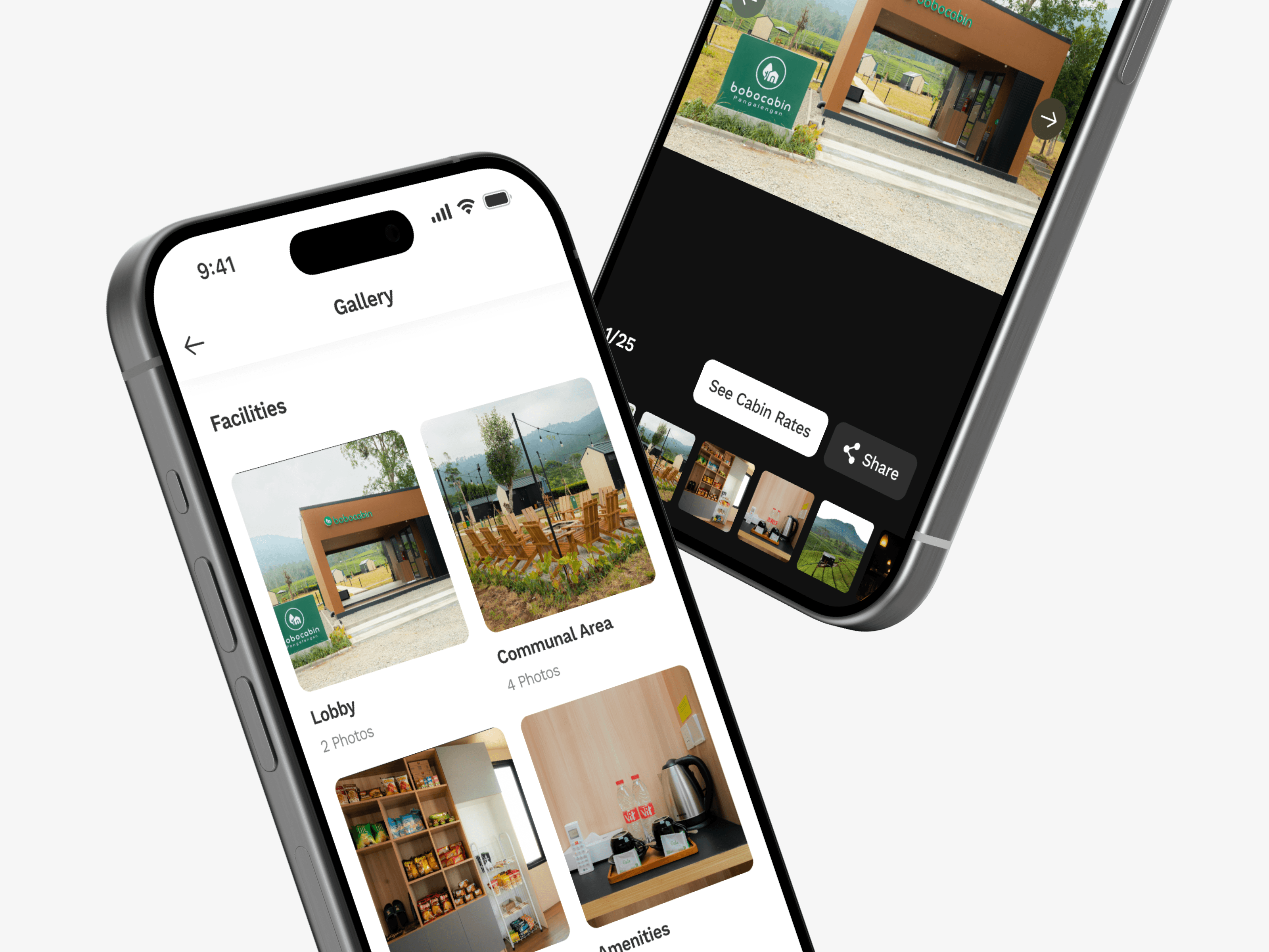
Facilities Page
Guide Page
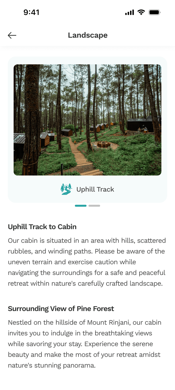
Landscape Page
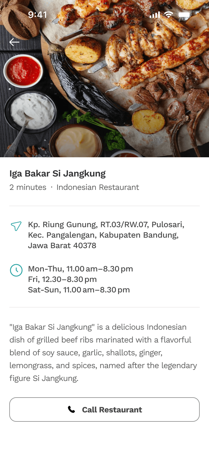
Nearby Place Page
DETAILS TO LIGHT THE WAY
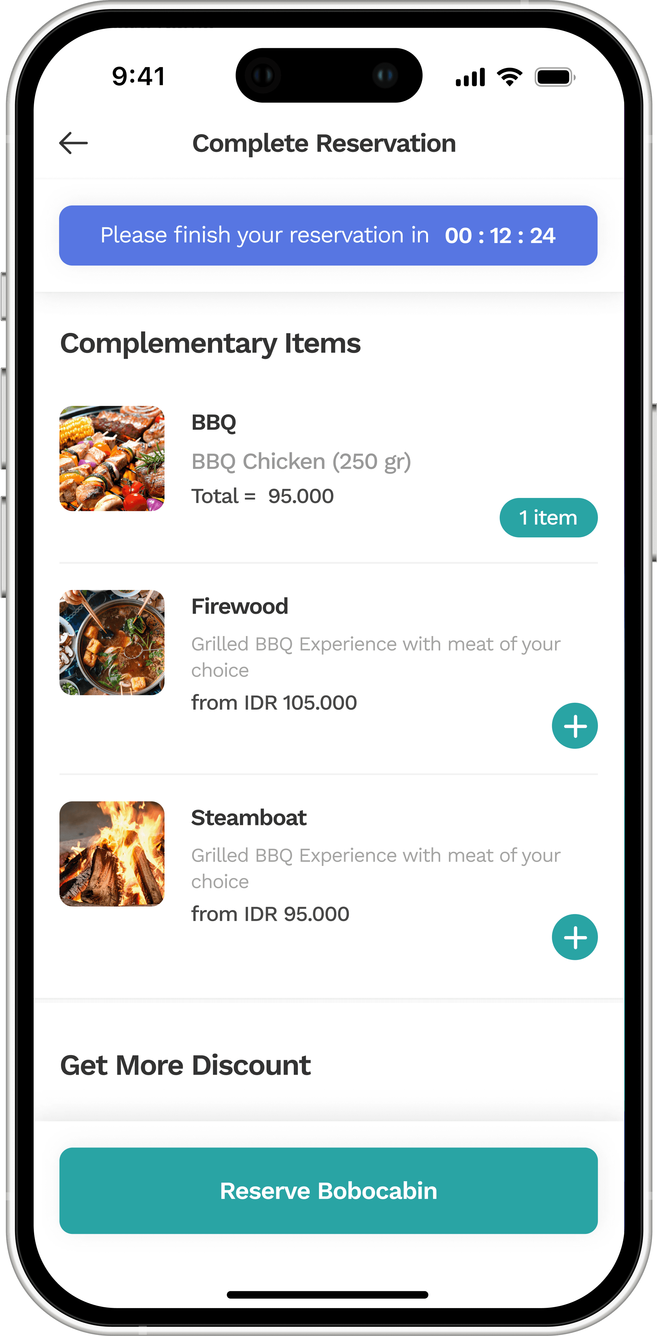
ADD ONS AND CHECK-OUT FLOW
No small talk is needed and have it ready by dinner time. Payments are included with the room bookings, so of course no separate payments are required.

Pain reliever towards #2 problem. Adding extras is the first thing that user encounters when they're meddling in the reservation flow. Here, options are sewn up with:
1
Stepper and Timer On Top
Guided checkout, as we found from testing earlier, helped to navigate easier and more concisely during the completion flow. The timer is added to hold accountability and as a mode to keep the rooms on hold.
2
Food List and Selection
All of the selections that are available for additions are listed along with the specifications, hence user could pick what they want and customize the options.
3
Current Total Price
At last but not the least, the price point help to give notice on users on how much they're going to spend on, with elaborated drop down to show before and after extras added.
Elaborate preference for food of your choice.
Book for someone else? You can have it easy~
Keep your payment choice for next booking.

IMPACT & LESSON LEARNED
Due to re-prioritization during Q1 of 2024, the project is currently on hold.
On this project, I learned deeply how the hospitality industry works, especially when it comes to integrations with multiple third parties to ensure the rate plans and add-on options can be accessed from partners we've worked with.
I also learned a lot of new ways to see interface design more uniquely by re-thinking composition, interaction, and position to make it look beautiful and functional, yet usable for different demographics at the same time.
All of the above was also done while actively bringing something new to the table to seek out creative positioning.
Let's connect together. Find me at: syahra.aff@gmail.com
Continue to the next project?