

Strengthening product position for a cabin-based hospitality company.
Company
Bobobox
Time
Aug 2022
Role
Design & Research
Design Category
Landing Page Revamp
OVERVIEW
Bobocabin was first established to provide an alternative vacation during the pandemic
Grew from there, Bobocabin is now present with customers that seek sanctuary in nature, without forgetting their interaction with technology
Below, I explain how I transformed the previously experimental nature of Bobocabin into a grasping yet reliable storytelling for our customers to explore and gain clarity through

EARLY FINDINGS
At the beginning of 2022, the company discovered that the customers find it difficult to understand our product, Bobocabin.
Even after they stumbled upon the landing page, customers still struggled to comprehend the concept of Bobocabin.
The question revolves around what kind of things that it offers. Both as a place to stay and as a brand, the first impression did not leave a clear explanation.
During the same period, the company was actively scaling towards a bigger direction: more branches were opened nationwide and the popularity among Millenials & Gen Z also multiplied.
Hence it became necessary & very urgent to help our customers understand the core product value while building a strong positioning for the product.
We were confident that we could enhance and refine the prior landing page. Here are our initial presumptions:

Unclear product positioning, the landing page hero doesn't give clarity about the product
2
Not enough context about the cabin details and facilities for user to rely on to make stay decision
3
This page is disconnected from the booking flow, thus user can’t proceed to conversion directly
1
OBJECTIVES
Improve Bobocabin brand positioning on the product landing page
Enabling conversion through the product landing page
Build the right expectation to users about what Bobocabin is
Provide information and related details about Bobocabin for users
GATHERING RELATED INFORMATION
To begin with the improvement, we connected contexts from stakeholders that were involved in this project
UNDERSTANDING CURRENT SITUATION
The project scope focuses on accompanying our users during their discovery processes and gathering knowledge about the accommodations they’re about to stay at.
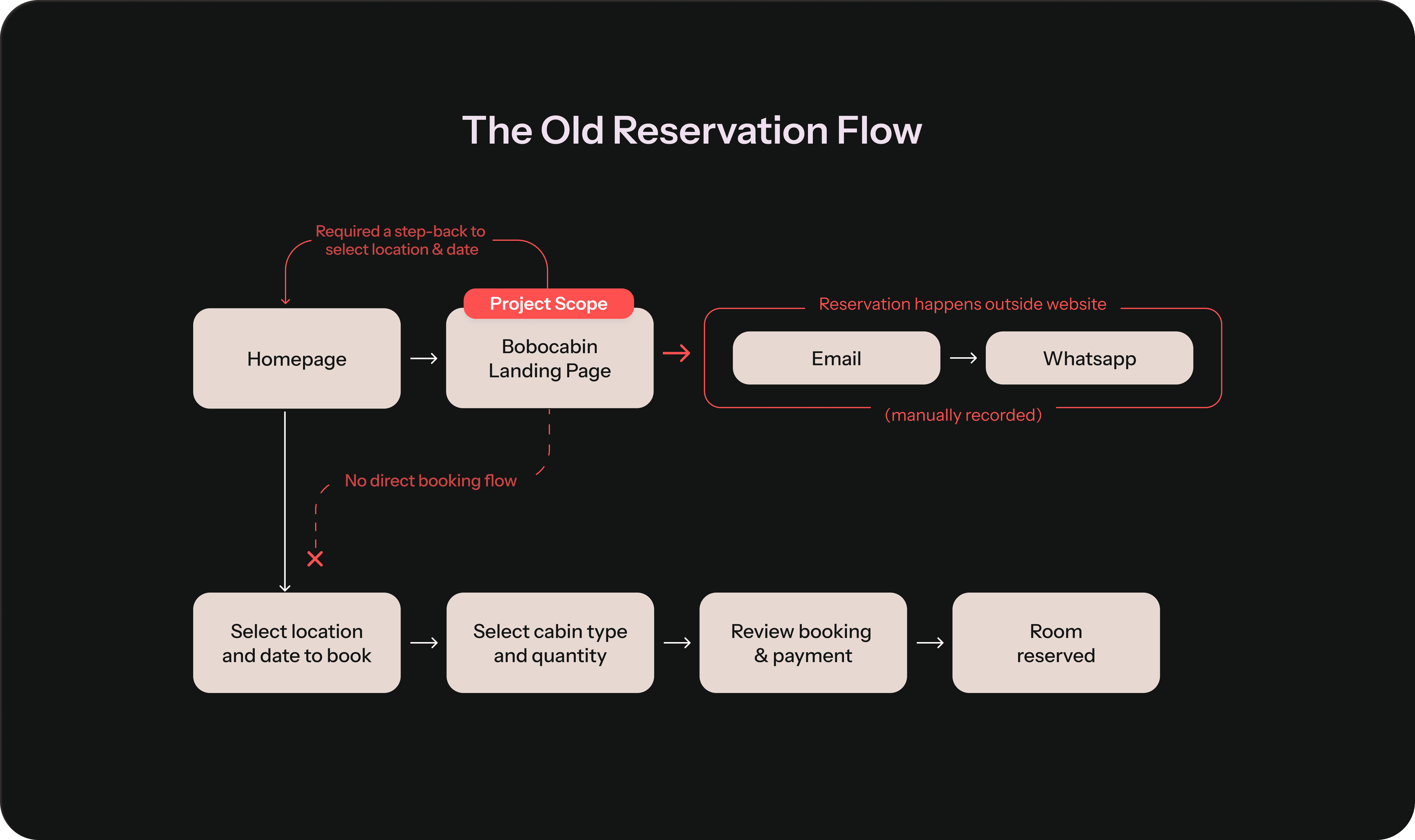
Bobocabin's landing page was disconnected from the rest of the booking flow on website, thus causing a back-and-forth flow for users who make their reservations through the website.
VALIDATING PROBLEMS
There was no prior research that explained the information about Bobocabin customers' discovery process.
Going from there, I decided to have a direct conversation with our customers. Here were the key points that I wanted to collect throughout the process:
Check on assumptions—was it indeed problems that our user faced?
Find out their discovery journey on Bobocabin & their experience staying
Detect more of their struggles & unmentioned pain points


When we had conversations with our customers, we found several key insights that helped us consider and re-consider things later on during the solution-shaping process.
KEY PROBLEMS WE MAPPED OUT
In customer-facing scenarios, users encounter the inconvenience of not being able to proceed with bookings directly from the landing page.
Proceeding means either entering a broken flow or needing to continue through a looping flow. Our findings showed that their alternative solution to this was switching to another booking platform for the sake of smoother action.
On the business side, when users transition to Online Travel Agents (OTAs), the impact also leads to a decrease in the average room rates received at our end.
The old version contains bulky paragraphs that users, unfortunarely, skipped a lot.
Their dissatisfaction didn't stem from the cabin itself but rather from unforeseen circumstances in the surrounding area. The problem arose from the discomfort of not knowing what processes they would have to navigate once they stayed, very earlier in advance.
Here are the things that become surprises for our customers:
DESIGN PRINCIPLES
After stacking up the insights and discomfort from our users, we created a north star.
These north star guided and helped us during the solution-sculpting process. I set a series of design principles below to make sure that our final solution is aligned with the previous insights,
Highlighting first sight encounter with Bobocabin using visual cues like photographs, videos, and illustrations
Centralized informations about each Bobocabin’s specific information to help them make booking decisions.
Set up sense of space for users to feel the serendipity while softly drive them to purchase Bobocabin.
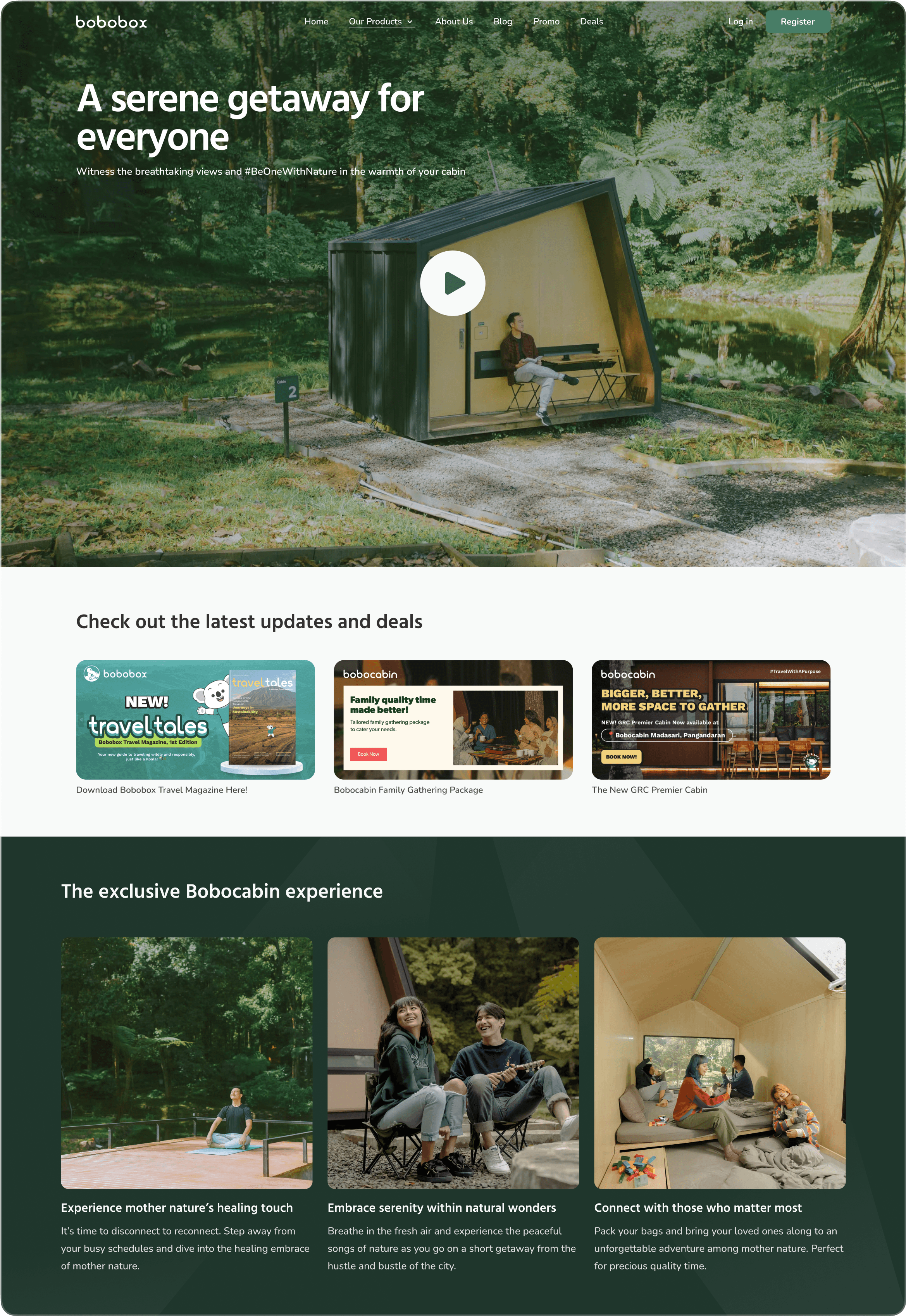
I - FACE OF THE PAGE: THE HERO
Love is a strong word. We want our customers to be curious and fall in love after seeing the tranquility of nature that blends with the cabins.
2
Several other attempts to redefine a hero section that grips
Alternate explorations for the hero before deciding on one.
Emphasizing post-pandemic important values as upfront highlights
Healing, nature, quality time; all that user seek from Bobocabin.
HIGH LEVEL PERSPECTIVE ON BOOKING
The new landing page simplifies the reservation flow within one page.
Concise & more straightforward.

Access to each branch easily and connect to the availability calendar
Here, we fixed what was once broken: connectivity to reserve cabins directly.
Besides book a cabin directly, other revenue-related initiatives are also introduced
Pre-sale booking: Introducing early for soft launching on a new branch
Ancillaries: Illustrating amusements customers can find on the spot
Group booking: Facilitating groups order for big gathering
Explore and find the cabin of your desire
When we were talking to our users, we found out that our users love to see the possibilities where they can go to visit Bobocabin, after staying at one. This especially because the branch locations are still limited
"I'm keen on trying other branches (of Bobocabin). The cabin is decent and the view is awesome.
Each branch offers unique landscape forms—thus making me want to visit other locations even more."
The pattern shows through all of our respondents, thus we tried to incorporate this into the new design.
From 1 branch, now becoming 16. Glimpses of each location and related information helped users go through their options more easily.
3
Landscape Labels
1
Branch Name
4
2


Hills

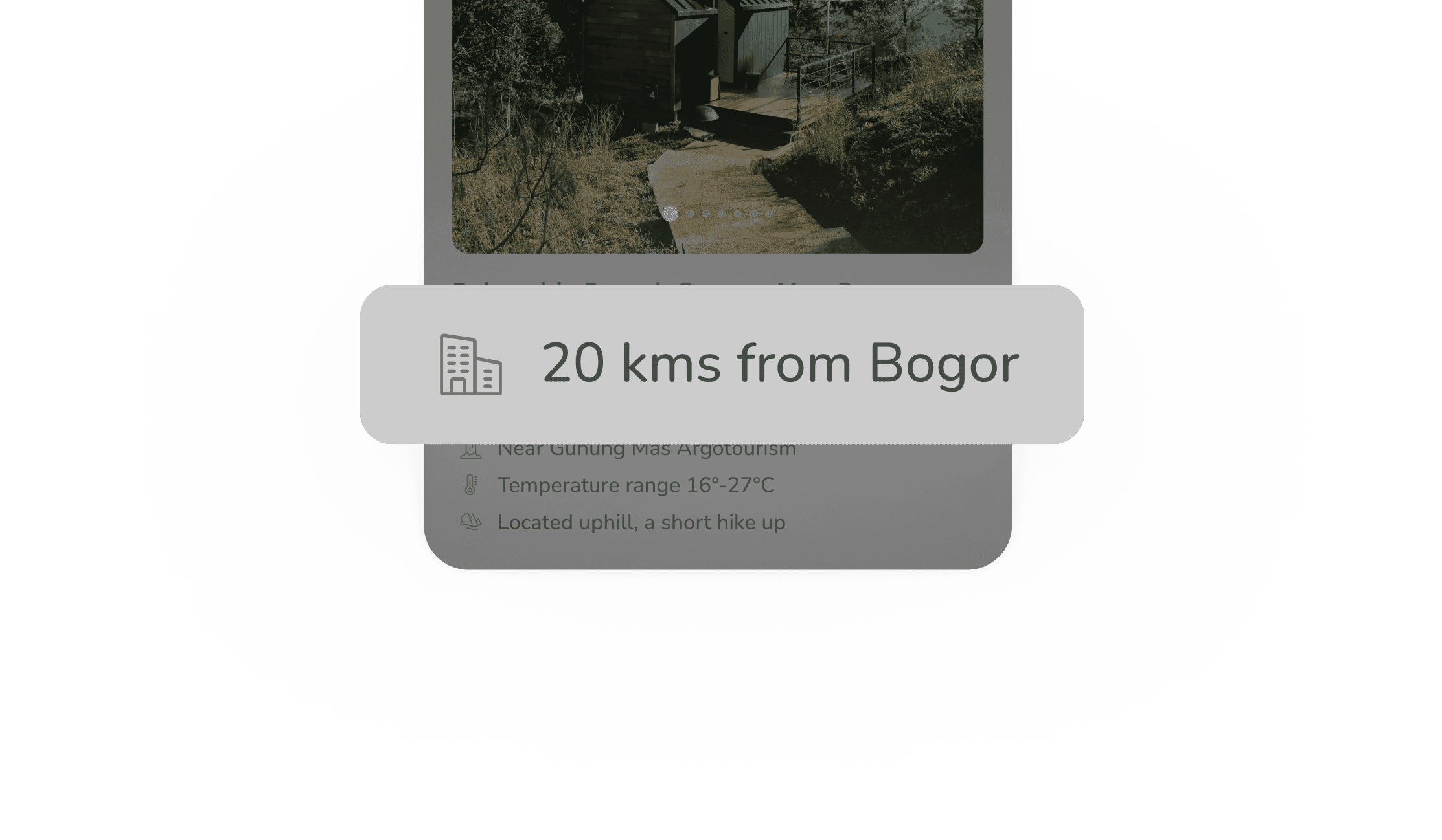
Bobocabin Puncak Gunung Mas, Bogor
Escape from Jakarta’s busy streets and enjoy a serene getaway with Gunung Mas' beautiful view
1 hour 30 min from Bogor
Near Gunung Mas Argotourism
Temperature range 16°-27°C
Located uphill, a short hike up
See room details with ease, and choose the one that suits the most
Our user often feel confused on the differentiation of each type, since there was heavy limitation of the legacy system that was built mainly for capsule hotel necessity; not cabin.
There was no swipe-able pictures of each branch, no swipe-able elaboration room type that was accurate for each room. This landing page is also functions as a page that give awareness about all of the room details so user could understand better which type favors them the most.
SOME ALTERATIONS ALONG THE WAY
It turned out not everything was well-perceived
We circled around the design on internal feedback, resulting in several changes.

For users, understanding time is more natural than comprehending distance
We initially put distance, in kilometers, which favors the majority of Indonesian citizens
However, from our user interviews and internal feedback, we recall that most of our customers grip the concept of time is easier to measure than distance and most of them
Especially during travel, the focus is often centered in the desire to minimize the duration take it takes to reach the destination.
As I look closer, familiarity and auto-timer triggers help
users provision better scenarios & clues
While micro interactions might be a unique point for the website, they create
a sense of distance for users and leave them feeling not guided enough.
IMPACT AFTERMATHS, AFTER ALL
The new Bobocabin landing page attained more than 100k traffic within the first quarter after realease and sat atop of search engine results after combining with SEO implementation*
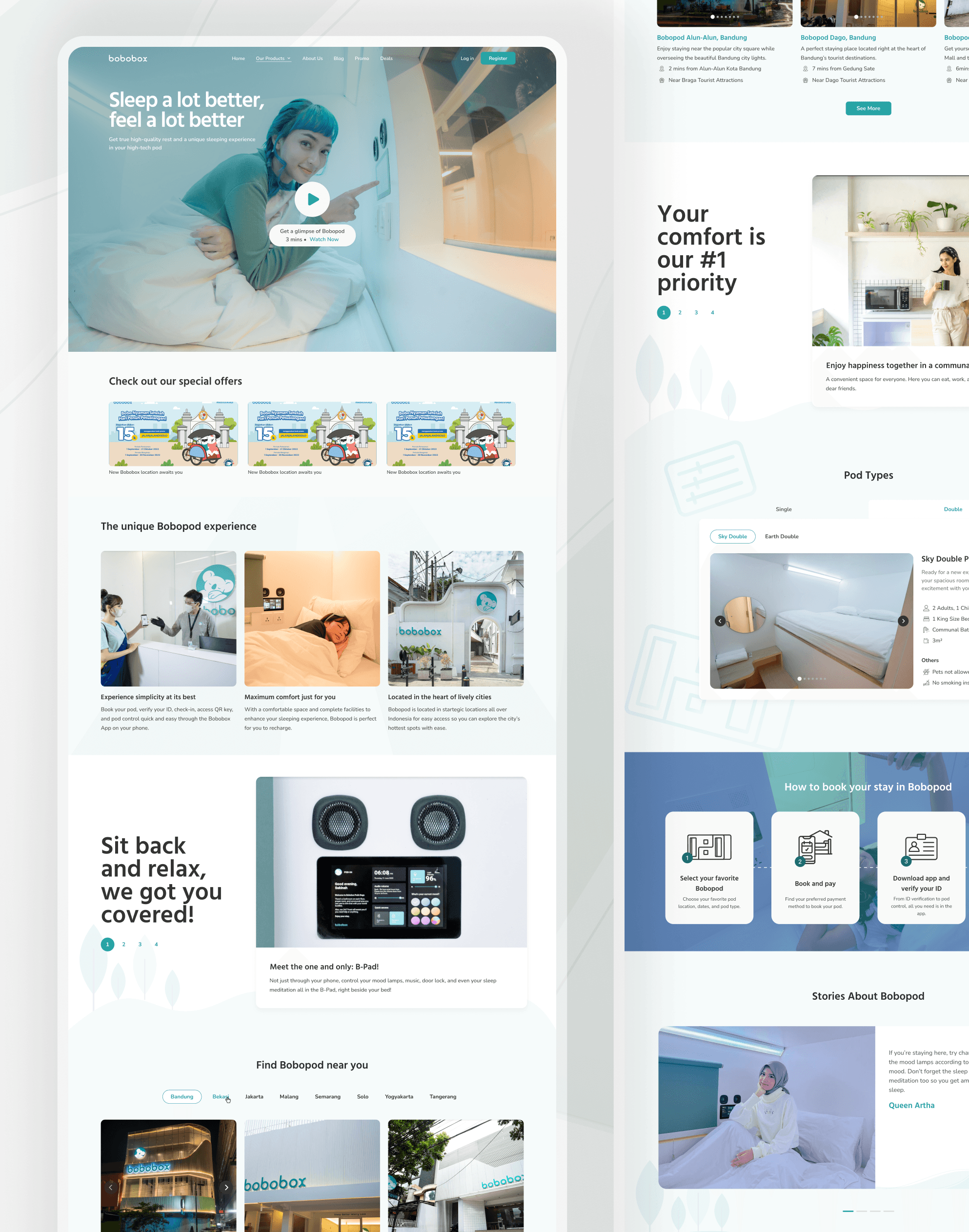
The base storyline was also implemented for another product of hospitality from the company in the form of a capsule hotel called Bobopod.
*due to the confidentiality of NDA, the disclosed information may not represent the real number
Due to the success of the revamp, we also implement the design changes on another product: Bobopod.
(prev. known as Bobobox)
TAKEAWAYS
Tackling a problem also means starting with deeply understanding the perspectives of the ones who care about it the most—even though that also means wearing different hats at once.
By considering many intentions as early as possible and incorporating them into the design decisions, I was able to connect and fathom them into a final solution
At times, what may look simple could also contain so much hard work and effort, especially beyond the screen. I learned a lot about how to rethink scalability and go-to-market strategy through this project.
Not just simply deliver the design, but also how our users can make the most out of it within their journey of discovery.
Thank you for reading, scrolling, and making it this far! :)
Let's talk! Contact me through syahra.aff@gmail.com
Continue to the next project?
